M2-19 (2019 PFP)
So these are the M2 icons for 2019-2020. I dubbed these icons the M2-19, hence it's going to be used in 2019. It went through over 20 different designs, until I found just the one. This also had to fit in some guidelines:
-Fits nice inside a circular icon.
-Streamlined look.
-Identifiable from a small scale (24x24px)
All of these are 1024x1024px btw. The icons are missing are the 4 transparent variants, but due to AS not setting these icons in transparency, there's all straight up white.
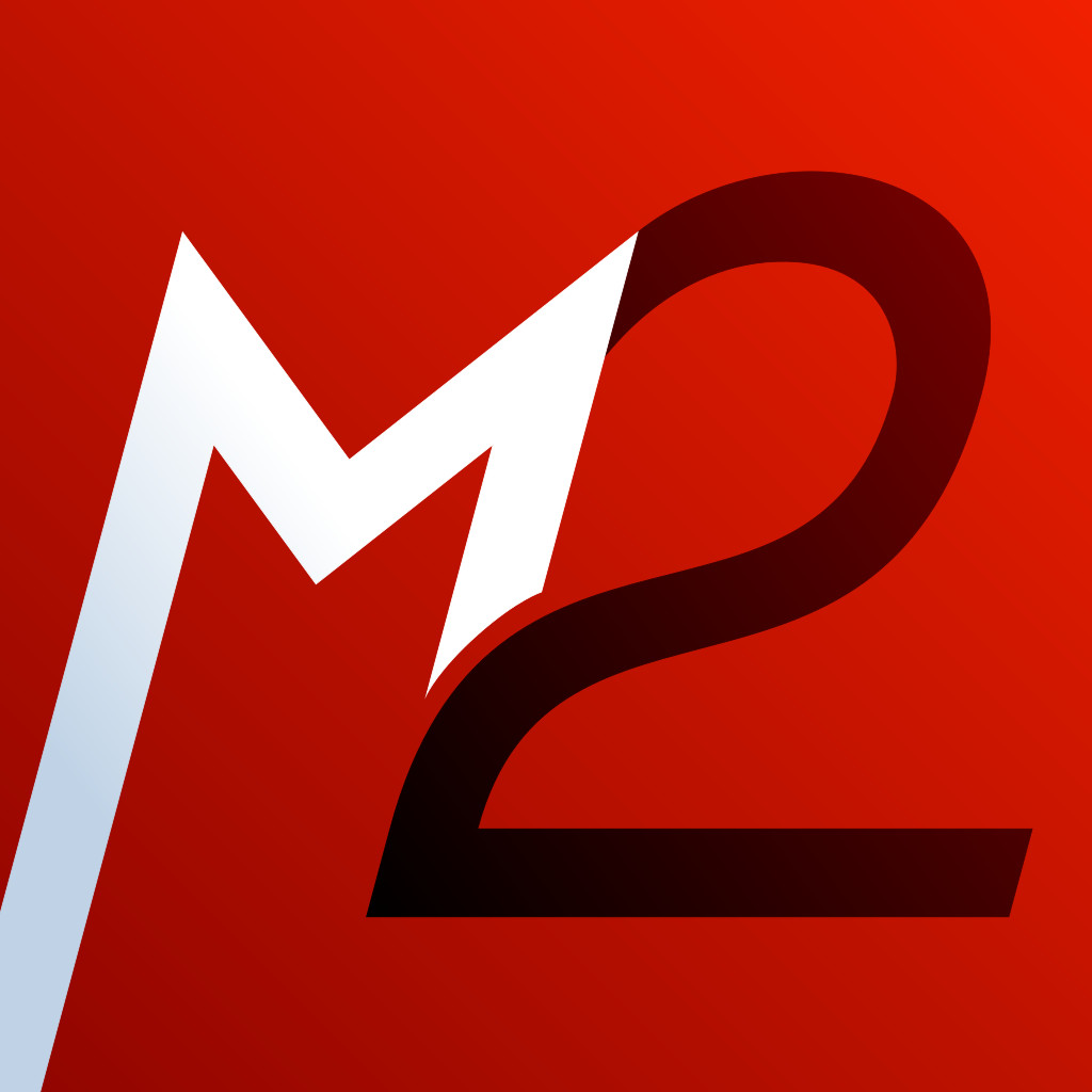
"M2i+" (Italic variant. The main icon)

"M2+" (Straight variant)

"M2 Basic" (Straight, only 3 colors)

"M2 S" (Straight, Minimalist variant)

"M2i Basic" (Italic, 3-Color variant)

"M2i S" (Italic, minimalist variant. Formerly used as my Twitter icon)